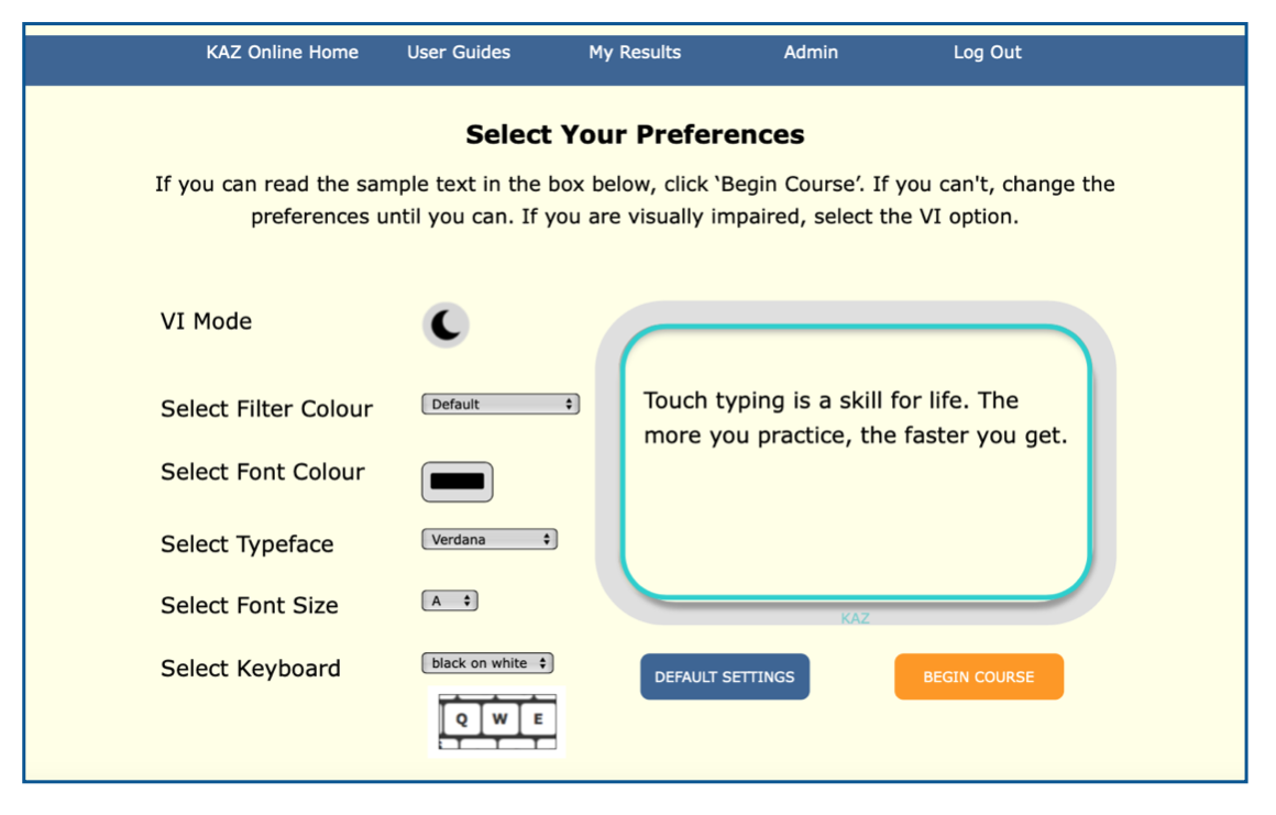
Specialised Preference Screen
Visual disturbances can present themselves in many ways - white glare from background screens causing headaches, blurring, letters rotating, flipping, crowding and running into each other.
Over the past twenty years, Dr Sue Fowler and her team at the Dyslexia Research Trust (Reading Clinic and Oxford University) have conducted extensive research, trials and visual assessments on over 10,000 children. Results found that applying a specific frequency of blue filter to help stabilise letter movement and of yellow to minimise blurring was extremely successful in the majority of children suffering from visual disturbances and had either improved or eliminated their problems – resulting in a rapid improvement in reading skills.
The Thomas Pocklington Trust is a national charity that supports blind and partially sighted people, focusing on education, employment and engagement. Their mission is to support visually impaired people of all ages to live the life they want to lead.
“Of all the traditional teaching methods I’ve seen, KAZ offers a unique teaching style that I feel could be more engaging for students learning to touch type. It’s pleasing to see such a comprehensive course out there.”
Graham Page (Technology officer, Thomas Pocklington Trust)
Our specialised ‘preference screen’ was developed with advice, guidance and research findings from both the Dyslexia Research and the Thomas Pocklington Trusts. It caters for visual impairment and addresses visual disturbances, tailoring the KAZ course for maximum visibility and comfort.
-
VI option including ‘speaking keys’ and spoken instruction and compatible with JAWS and most other screen reader -
Choice of coloured background/filter screens for reducing white screen glare, including a ‘customise’ feature, catering for individuals with Meares-Irlen Syndrome -
Choice of two specific DRT research-based background/filter colours to stabilise letter movement and reduce blurring -
Choice of dyslexic-friendly typefaces (including three licensed dyslexic fonts) for ease of reading -
Choice of font colour for contrast from the background screen colour -
Choice of font size for optimum visibility comfort and to minimise fusing and crowding of letters -
Choice of online keyboard for optimum visibility and comfort

Once learners have chosen their preferences and can read the sample text comfortably, their options are saved and applied throughout the course.

 Course Login